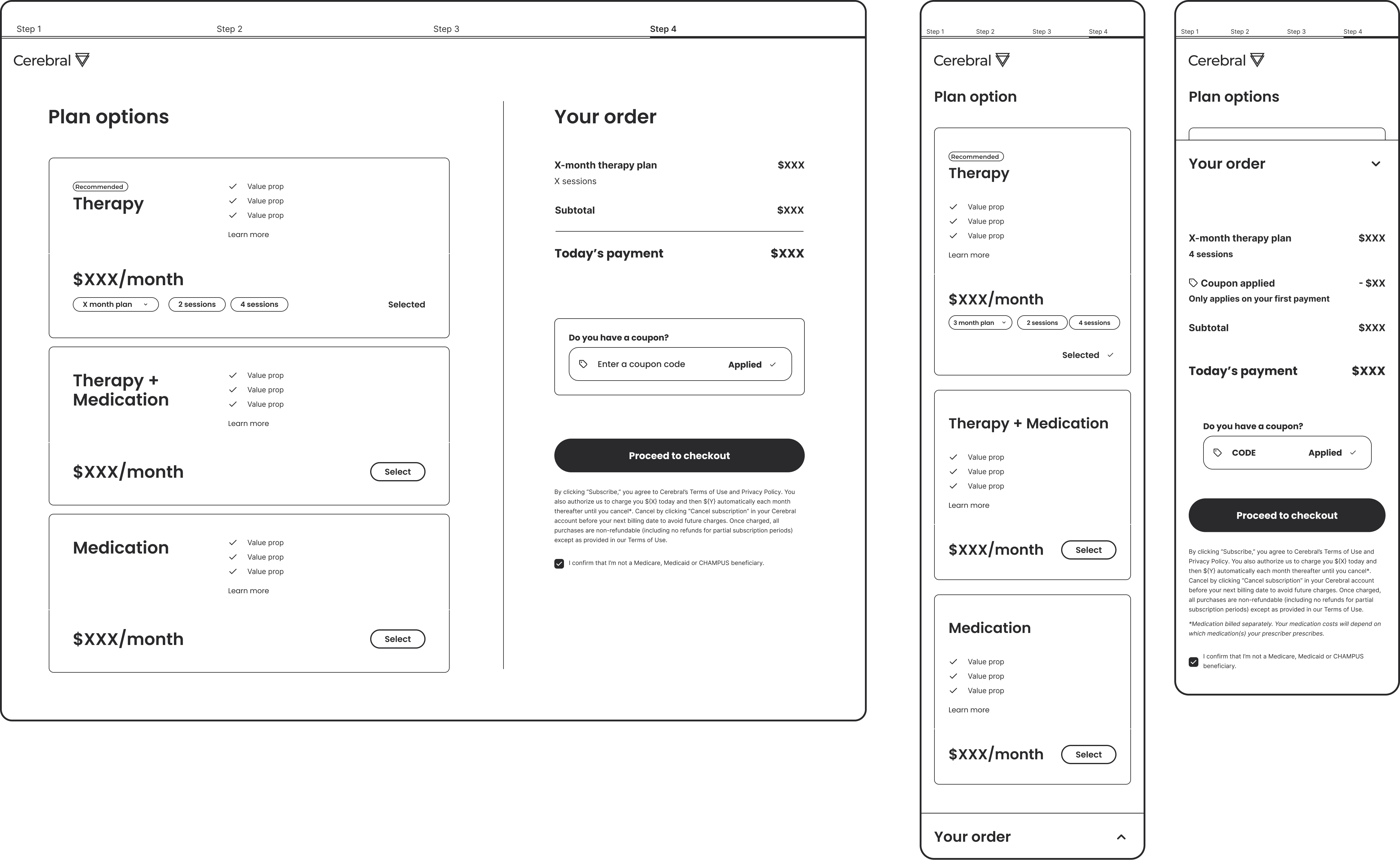
Restructured plan selection and order summary across desktop and mobile.
What does a patient actually need to feel confident enough to commit?
Cerebral offered three care paths: therapy, medication, and therapy plus medication. The plans themselves weren't the issue. The problem was that once a patient arrived at checkout, there was almost no room to adjust anything. Fixed session counts, opaque pricing, and a plan comparison experience that made it genuinely difficult to understand what you were paying for or why.
The data reflected it. Twenty-five percent of subscribers cancelled within the first 50 days, a churn rate high enough to threaten the business's ability to retain the patients who needed continuous care most.
When we came onto the project, there wasn't a fully defined brief. Our first task was to create one, scoping what was realistic to improve in a single push without requiring a platform overhaul.
"The checkout page doesn't provide enough details and doesn't make me feel confident about what's part of the monthly bill, including the discount."
Early in the process, we explored a fully modular, a-la-carte plan builder, an experience where patients could construct their own care plan from individual components. It was the most flexible direction, and it had real appeal.
We decided against it.
A fully modular system would have required rearchitecting how Cerebral's billing was structured, introduced more decision complexity at an already high-drop-off moment, and was not achievable within a one-month timeline. The existing plan types were clinically sound. Patients weren't confused by the categories. They were confused by what was inside them, what it would cost, and whether it could adapt to their situation.
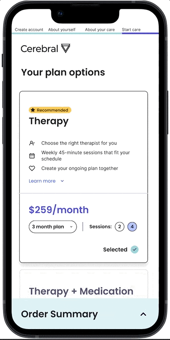
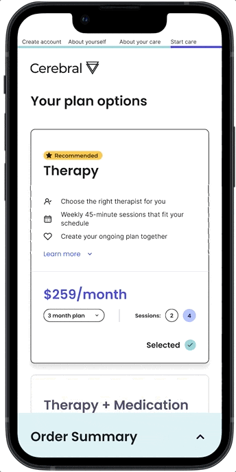
So we worked within the established structure and added a controlled layer of flexibility: patients could now select their payment term (1, 3, or 6 months) and choose their session frequency within therapy plans. Enough customization to feel responsive to their needs. Structured enough to ship reliably and without downstream billing complexity.
The plan selection page was doing three things wrong simultaneously.
We restructured around a single primary action: choose a plan. Plan cards surfaced the most decision-relevant information first. The order summary became a live readable confirmation. Both desktop and mobile were designed in parallel, not as an afterthought.
.png)
The redesigned experience gave patients something the previous checkout hadn't: a sense of control. Not unlimited flexibility, but enough to feel like the plan reflected their situation rather than a fixed menu they were being asked to accept.
For the business, the restructured subscription model also created new operational headroom. By mapping plan options to Stripe's pricing infrastructure more cleanly, it became possible for the team to test pricing strategies that the previous architecture had made difficult to run. That emerged as a downstream benefit of the structural work, not an original goal, but meaningful nonetheless.
This was a first push, not a complete overhaul. The scope was deliberately bounded. But the decisions made here, about what flexibility to introduce and where to hold the line, established a checkout foundation the team could build on.
