Affinity clustering and heat mapping across 11 interviews and shadow sessions.
Cerebral is a subscription-based mental health platform offering virtual therapy, psychiatry, and medication management. I led this project as the sole designer on a three-month engagement, working directly with the product manager, clinical stakeholders, and the Clinical Advisory Board.
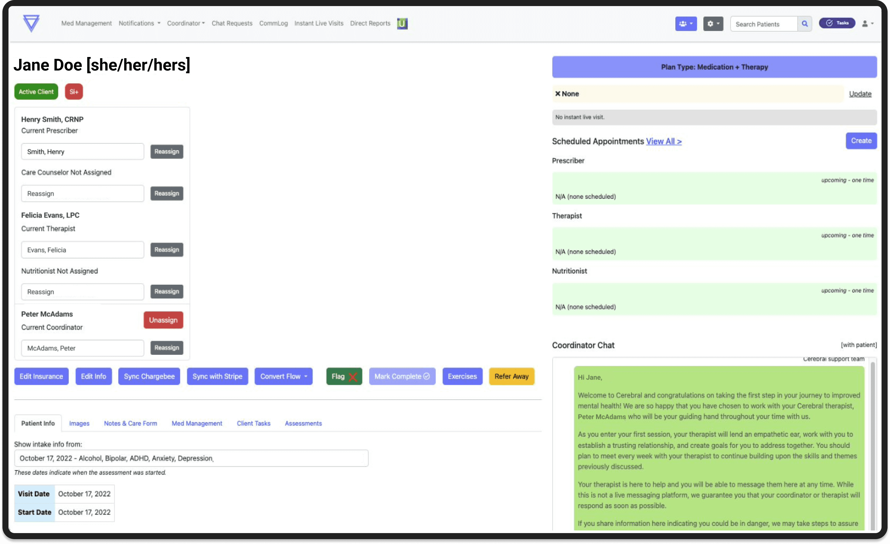
The patient chart was the central tool clinicians relied on, but it hadn't been designed around how they actually worked.
Critical data was buried. Navigation required excessive scrolling. And because clinicians aren't compensated for pre-visit preparation, every extra minute spent hunting for information was time they absorbed personally.
The problem wasn't cosmetic. The goal wasn't just to make navigation easier. It was to get clinicians to a place where pre-visit prep was significantly reduced, and where a provider could hop into a visit, quickly orient themselves on what mattered, and actually show up for the patient in front of them.
"It's like going on a scavenger hunt for the right information. You have to keep expanding and scrolling to find what you need."
The gap wasn't effort. It was the tool. That reframe changed the design goal. This wasn't about reducing scrolling. It was about giving every clinician, regardless of prep time, faster access to what they needed most.
Wireframing surfaced a real tradeoff between two navigation directions.
One kept the existing tab structure and layered a patient summary on top. The other introduced a collapsible left panel that freed up screen space and moved sub-navigation out of the tabs.
The left panel wasn't just a layout preference. It was a scalability call. The tab structure was already at its limit, and adding content would have required a full redesign. I tested both directions with clinical stakeholders, consulted engineering on feasibility, and brought a clear recommendation. We aligned on the left panel.
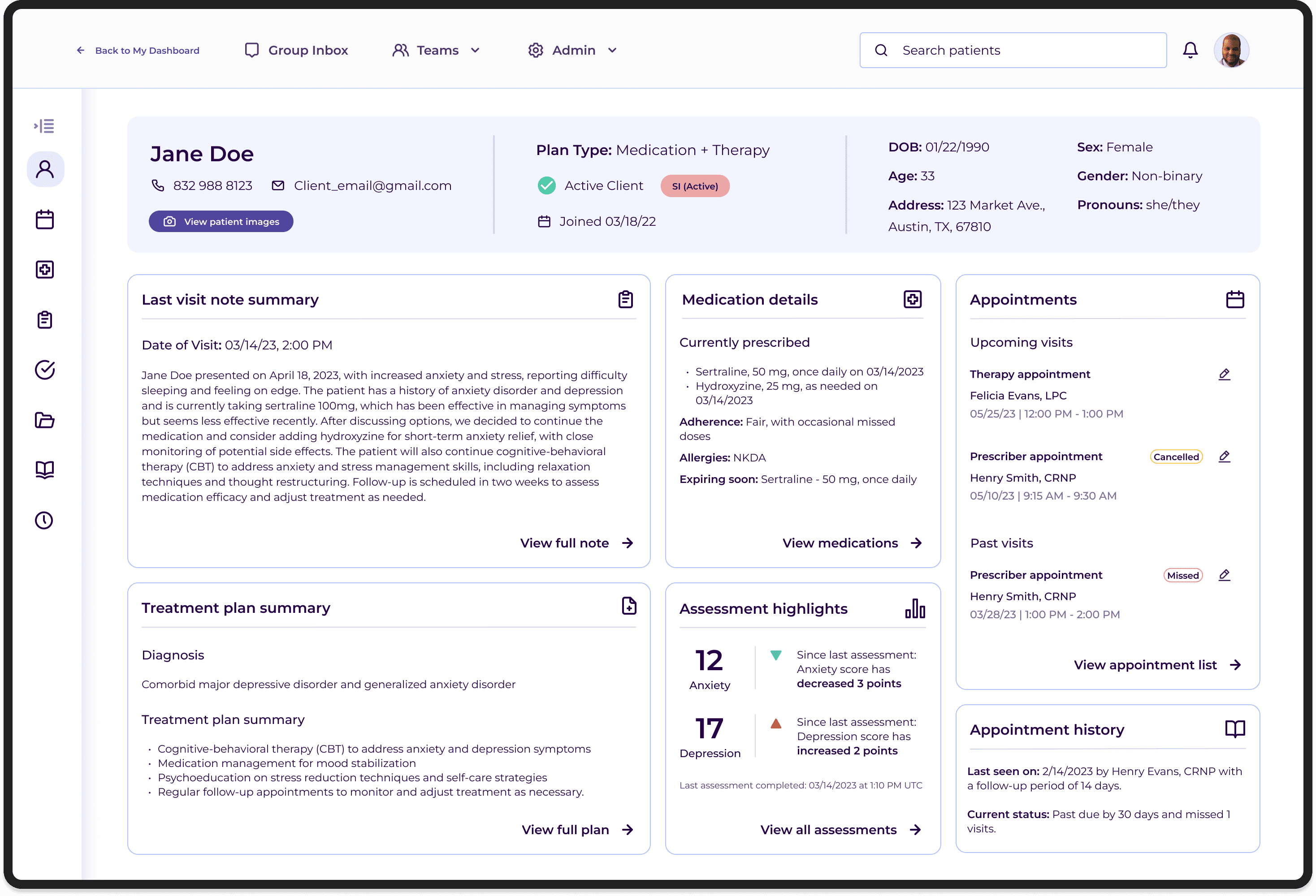
The patient summary was built directly from what clinicians told us they needed most before and during visits.
Each summary tile linked directly to its corresponding section in the full chart, acting as an intelligent entry point rather than a replacement for the detailed record.
A persistent bar across the top surfaced key demographics, subscription plan type, and insurance verification. Color-coded flags highlighted critical clinical signals, from allergies to documented suicidality, past or present. The flags weren't just a UX convenience. They were a patient safety feature.
The redesign entered development before the project concluded. Clinical stakeholders and the Clinical Advisory Board responded positively throughout, particularly to the color-coded flags and the patient summary's quick-link navigation. The direction aligned across product, clinical operations, and engineering, which was a meaningful signal in an environment where clinical and product priorities frequently pulled in different directions.
I would have treated the phasing plan as a formal design deliverable rather than a handoff note. Defining a concrete roadmap for deferred improvements before the project closed would have made it easier for the team to continue iterating without losing context. It's something I've carried into how I close out projects since.
