Nava Benefits is an AI-enabled healthcare benefits platform that helps HR administrators manage and audit employee benefits programs. The audit tool is AI-first: the system parses carrier invoices and employee census data, generates a structured audit plan, runs the comparison, and surfaces discrepancies for human review.
I was the primary designer for the audit experience, owning both the planning flow and the results workspace end to end.
The product could automate a process that previously took hours or days. But because the AI was doing the analytical work, users needed to understand how the audit was configured and why specific discrepancies were surfaced.
Without that visibility, the output feels arbitrary. No HR administrator is going to act on findings they don't understand. AI wasn't just a feature here. It was the system doing the work. My job was designing the layer between that system and the humans who need to trust it. Three tensions shaped every design decision:
The product team prioritized an assistant-first interaction model, and the decision was made to deliver planning within the existing chat interface rather than introducing a new standalone surface. The dedicated planning UI wasn't going to ship.
The underlying design thinking didn't get thrown out. It got translated.
The need for a clear, scannable summary before execution, the separation of high-level understanding from detailed configuration, and the support for both quick execution and deeper review all carried over into the chat-based model. That constraint is what led to the Plan Summary Artifact.
Instead of exposing the AI's configuration directly, the assistant translates it into something readable and scannable.
When the audit plan is generated, it surfaces in chat as a structured summary artifact. Users who trust the system can execute immediately. Users who want more control can open the full plan in a right panel. Two surfaces, doing different jobs:
Not every user needs to inspect the plan before running an audit. The summary card accommodates both without making either feel like the wrong choice.
The three-minute processing window shaped this experience specifically. That drove the design of the task tracker: showing meaningful milestones without exposing unnecessary system detail or making the experience feel unpredictable.


A discrepancy says "something looks off. Review it and decide." That distinction shaped everything about the results workspace.
Not every discrepancy is an error. Some are explained by timing, carrier billing behavior, retroactive changes, or acceptable variance. The system surfaces them. The administrator applies judgment. A two-column structure reflects that:
For v1, administrators have two resolution actions:
We intentionally kept v1 as a review-and-decision model rather than a task management system. Building something heavier would have meant making assumptions about user behavior we didn't yet have data to support.


I used Figma Make and Claude Code to prototype dynamic and state-based interactions more quickly. That helped the team pressure-test edge cases in the planning and results flows without waiting on engineering builds.
What shipped was a foundation. What it established was a product stance.
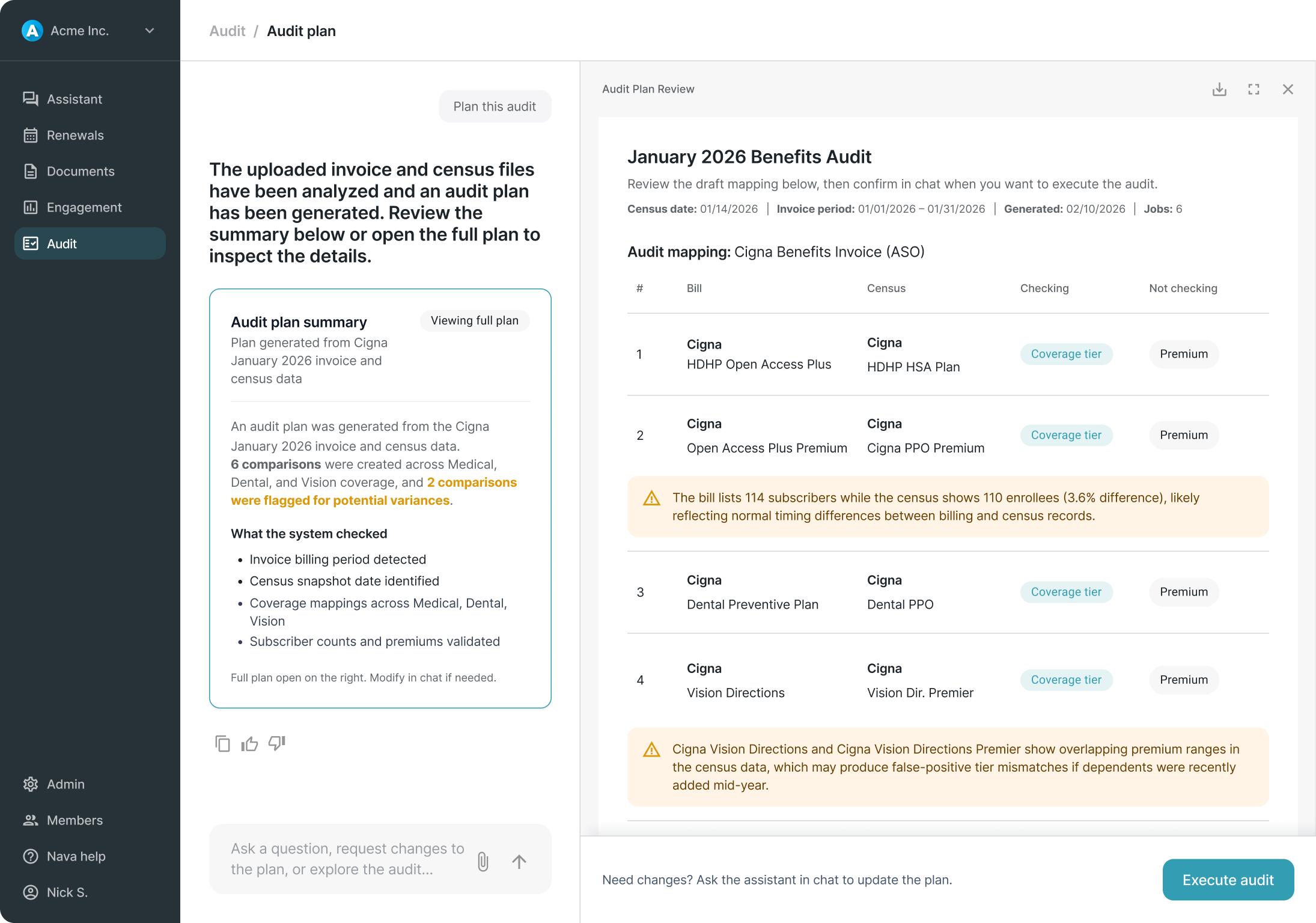
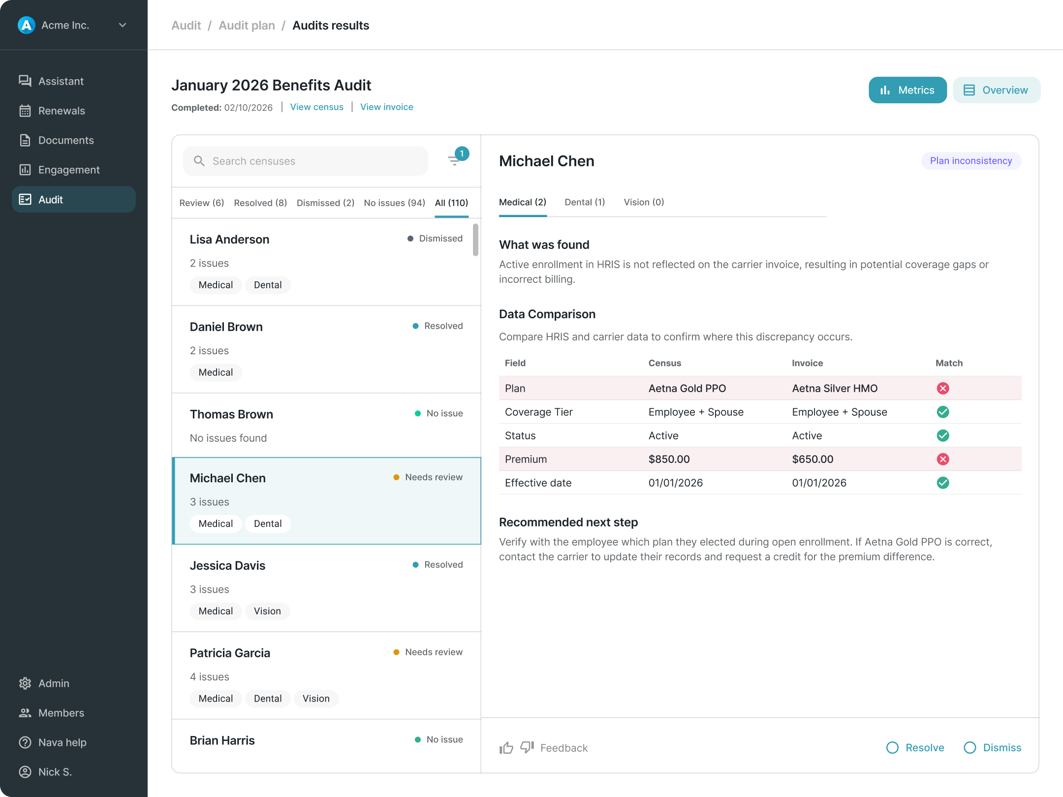
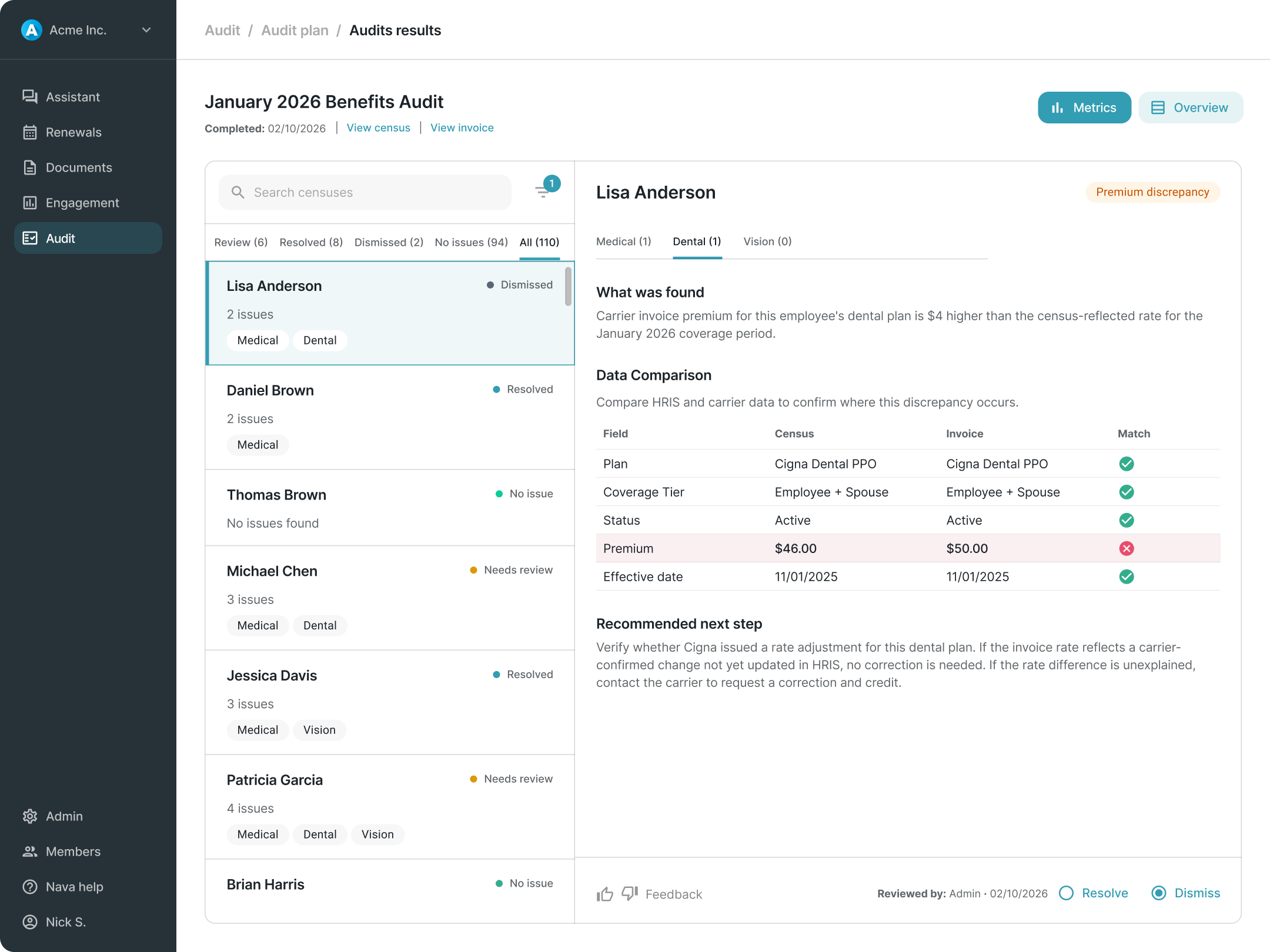
Usability testing confirmed that earlier designs, which exposed too much system detail during planning and used more narrative descriptions in results, created friction the final model resolved. The summary-first planning approach and simplified triage list both emerged from consistent feedback that earlier iterations were harder to follow and slower to navigate.
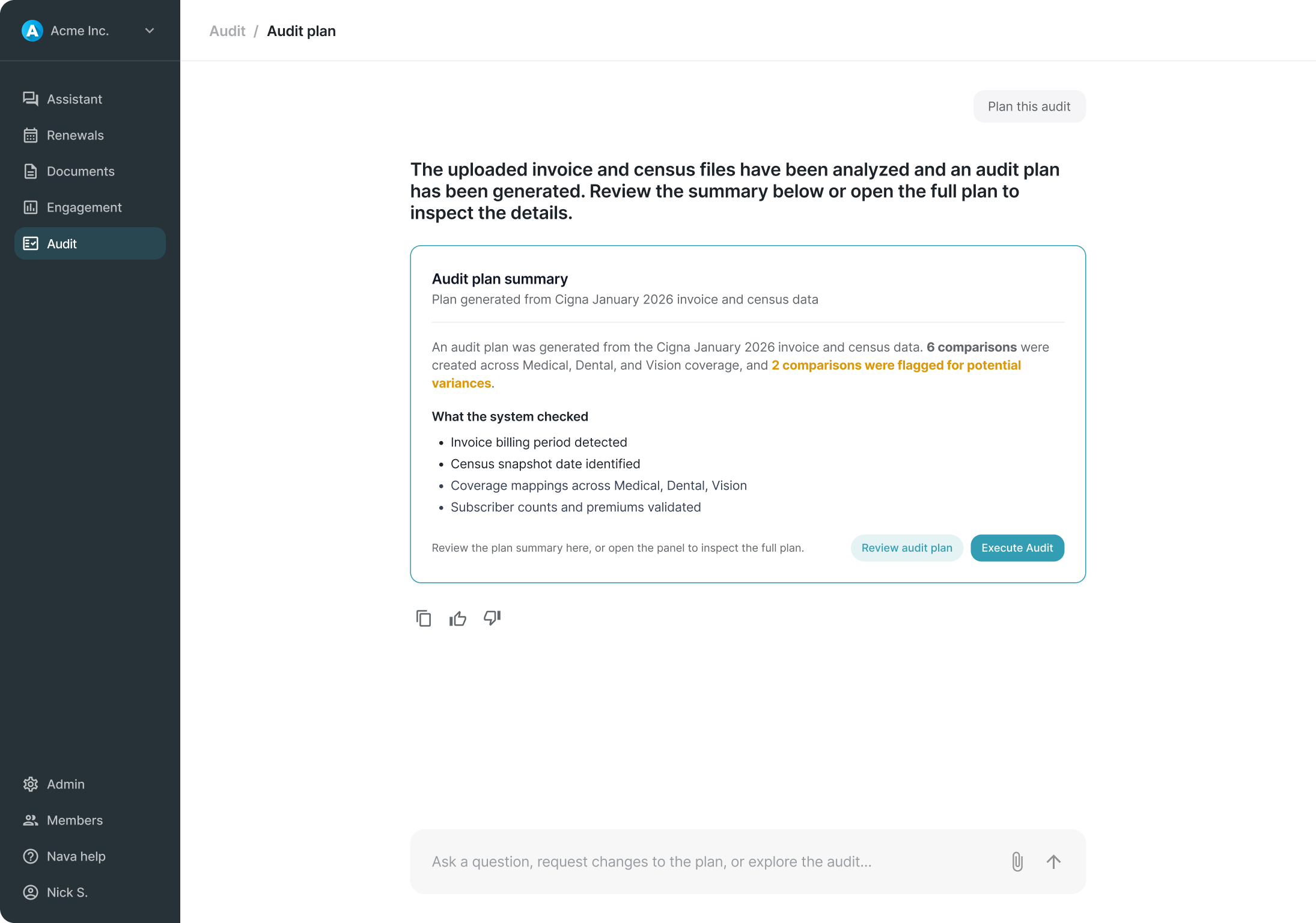
There are no post-launch metrics. But the experience was designed to generate them, particularly around whether users engage with the full plan before executing or proceed directly from the summary.
The broader contribution was establishing that the right product stance for v1 was a review-and-decision model rather than a task management system. A call that kept scope in check, avoided overbuilding on assumptions, and left room for the product to learn what a more mature system should actually look like.