Competitive analysis across 21 companies spanning mental health, wellness, telehealth, and subscription services.
Cerebral is a subscription-based mental health platform offering virtual therapy, psychiatry, and medication management. This was a two-month engagement with a three-person design team. I contributed across research, information architecture, and design.
The existing onboarding flow had a fundamental mismatch between what it asked and who it was asking.
It presented prospective patients with a list of mental health conditions to select from before they'd answered a single question about how they were feeling. For the majority of people coming to Cerebral, that was the wrong starting point.
Most prospective patients had no prior mental health diagnosis. They came confused, uncertain, and in many cases uncomfortable with the clinical language being thrown at them before the platform had done anything to build their trust. Asking someone who has never interacted with mental health care to self-select a condition from a dropdown isn't onboarding. It's a barrier.
The flow also had five separate variations running simultaneously across different plan types, with no consistent structure, language, or logic tying them together. It was difficult to maintain, difficult to improve, and impossible to personalize at scale.
The split was stark. Around 79% of prospective patients had no prior mental health care experience. They had limited familiarity with clinical terminology, felt uncertain about what to expect, and in many cases felt stigmatized by the process of seeking help. The remaining 21% had prior experience, were more confident, and needed a different kind of guidance.
The insight that reframed the project: these two groups needed fundamentally different onboarding experiences. Not different products. Different language, different pacing, and different levels of explanation at each step. A one-size-fits-all flow was failing the majority of users before they'd made it through the first few screens.
We could have approached personalization as a large engineering lift. Instead we found a lower-lift solution that proved the concept without requiring a full rebuild.
By focusing on copy customization tied to key signals collected early in the flow, we could meaningfully adapt what patients saw and read without duplicating the entire experience. The structure stayed consistent. The language shifted based on who was going through it.
This was also the moment we consolidated the five existing flow variations into a single modular system, designed around shared components and clear decision points rather than five separately maintained experiences.
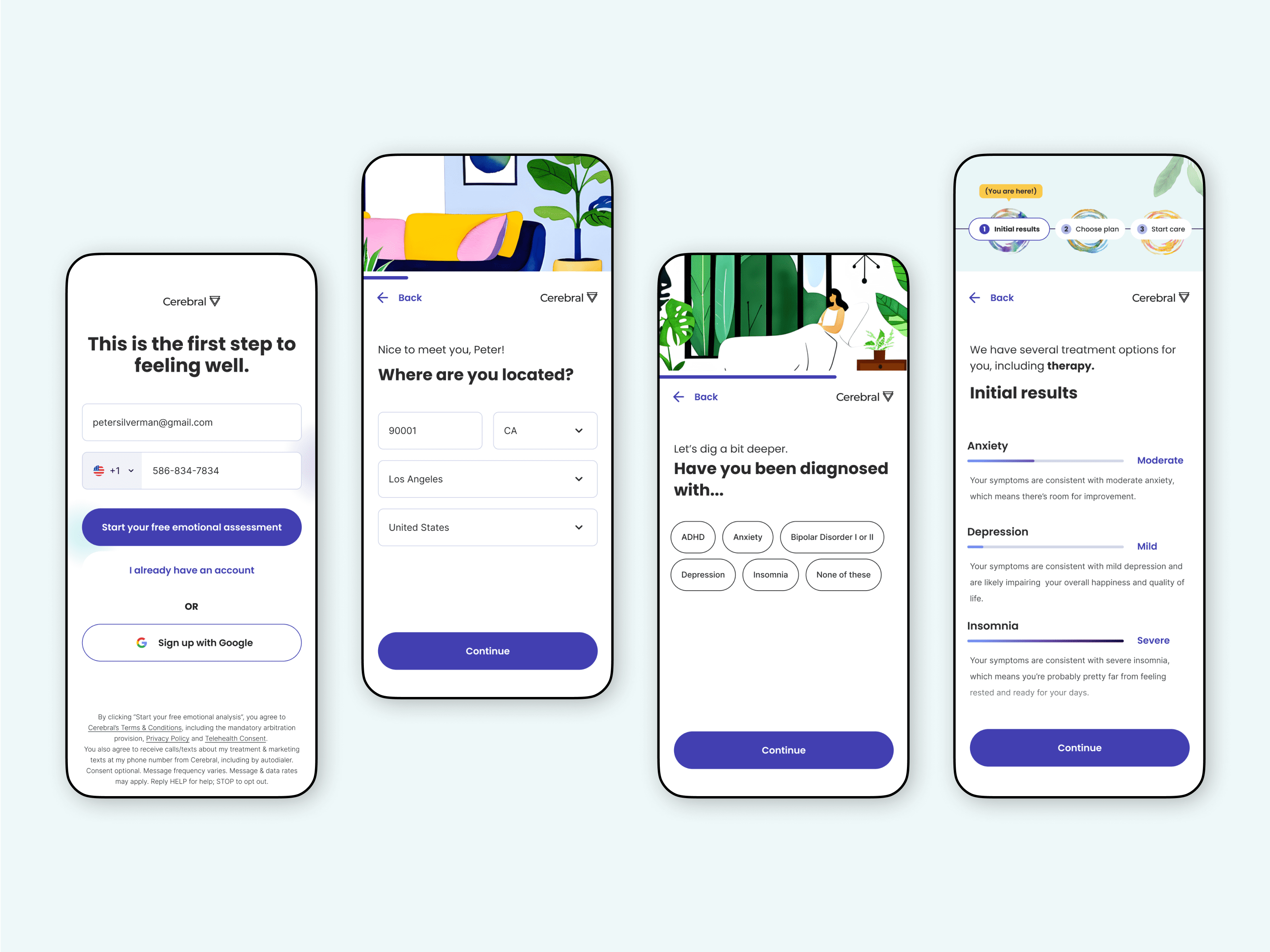
The redesigned flow introduced a conversational structure from the first screen, leading with how the patient was feeling rather than what condition they had.
We built two parallel journeys tied to the proto personas. Newbie Nolan received more explanatory copy, softer clinical language, and additional context at key decision points. Savvy Susan moved through a more direct path that respected what she already knew.
One of the harder constraints we worked around was the clinical assessment questionnaire. It couldn't be reworded without affecting its clinical validity, a fixed requirement we had to design around rather than through. Our solution was to restructure the experience around the questionnaire rather than within it, making the screens before and after it more conversational and supportive so the clinical section felt less jarring in context.
Beyond the flow itself, we introduced updated UI components and interaction patterns designed to improve usability and reduce friction at key decision points. A new illustration style was developed alongside these updates, built to feel warm and approachable without compromising the clinical credibility the platform needed.
The flow didn't fully ship in its original form, but its impact carried forward concretely. The UI components, interaction patterns, and illustration style we developed were integrated into Cerebral's design system and used across multiple products at the company. The positive response from early prototype testing also shifted how the team prioritized onboarding work, moving from incremental A/B testing on individual screens to a more focused investment in redesigning the flow holistically. The work became the foundation for that next phase rather than a standalone deliverable.
